Brand and Package Design
for Otro Yo
Otro Yo is a tequila brand focusing on vanilla, oak, and clove flavors. Tying the brand to its roots in Aztec culture, we designed its pattern around the Aztec sun stone and the name around the concept of renewal and replenishment.

This mood board is filled with key elements that helped define Otro Yo as a brand. We wanted Otro Yo to feel like a testament brand to the Aztec culture, filling its patterns with their symbolic sun stone and bringing in colors and textures that fit the part. We love these semi-vibrant, semi-subdued colors for our packaging because along with fitting culturally, it also represents the color of the drink as it ages.

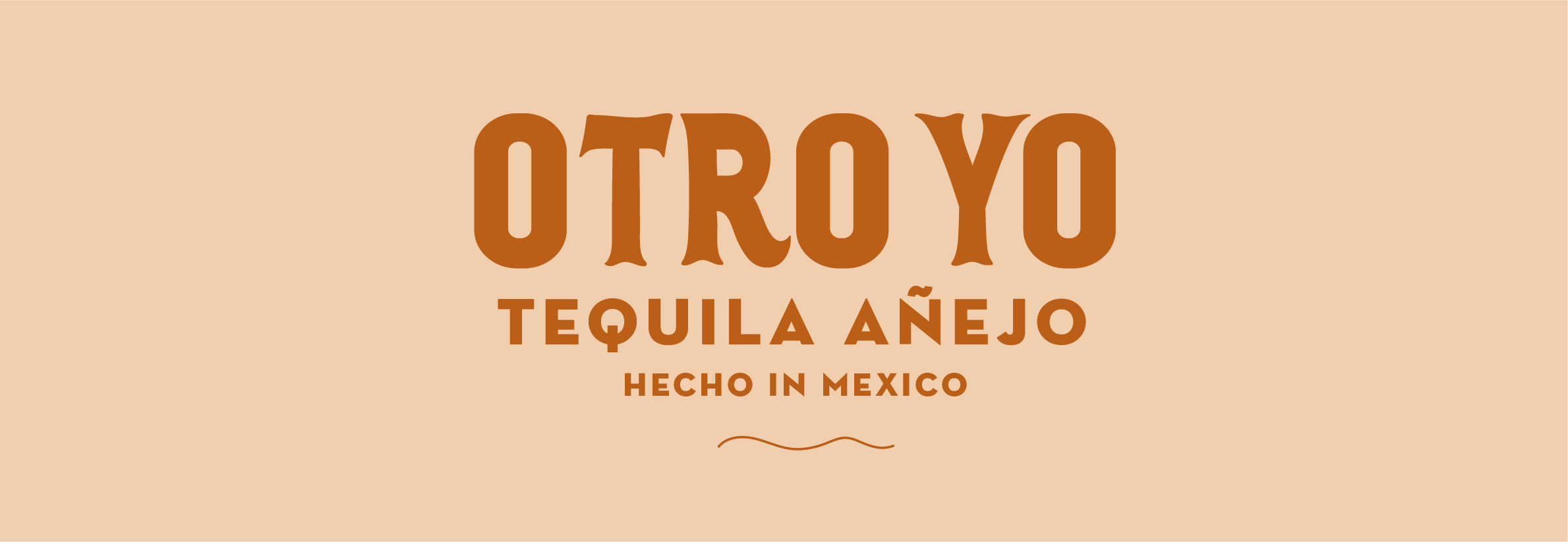
For the logo, we went with a simple letterhead because we knew it would be found mostly on packaging with busy patterns surrounding it. The curly customizations were meant to give each letter an authentic country feel.