Brand Design for Kiwi Mount
Kiwi Mount creates product and lifestyle videos for businesses that are looking to earn a return on their ad spend and for viewers who won’t have to click “skip ad.”
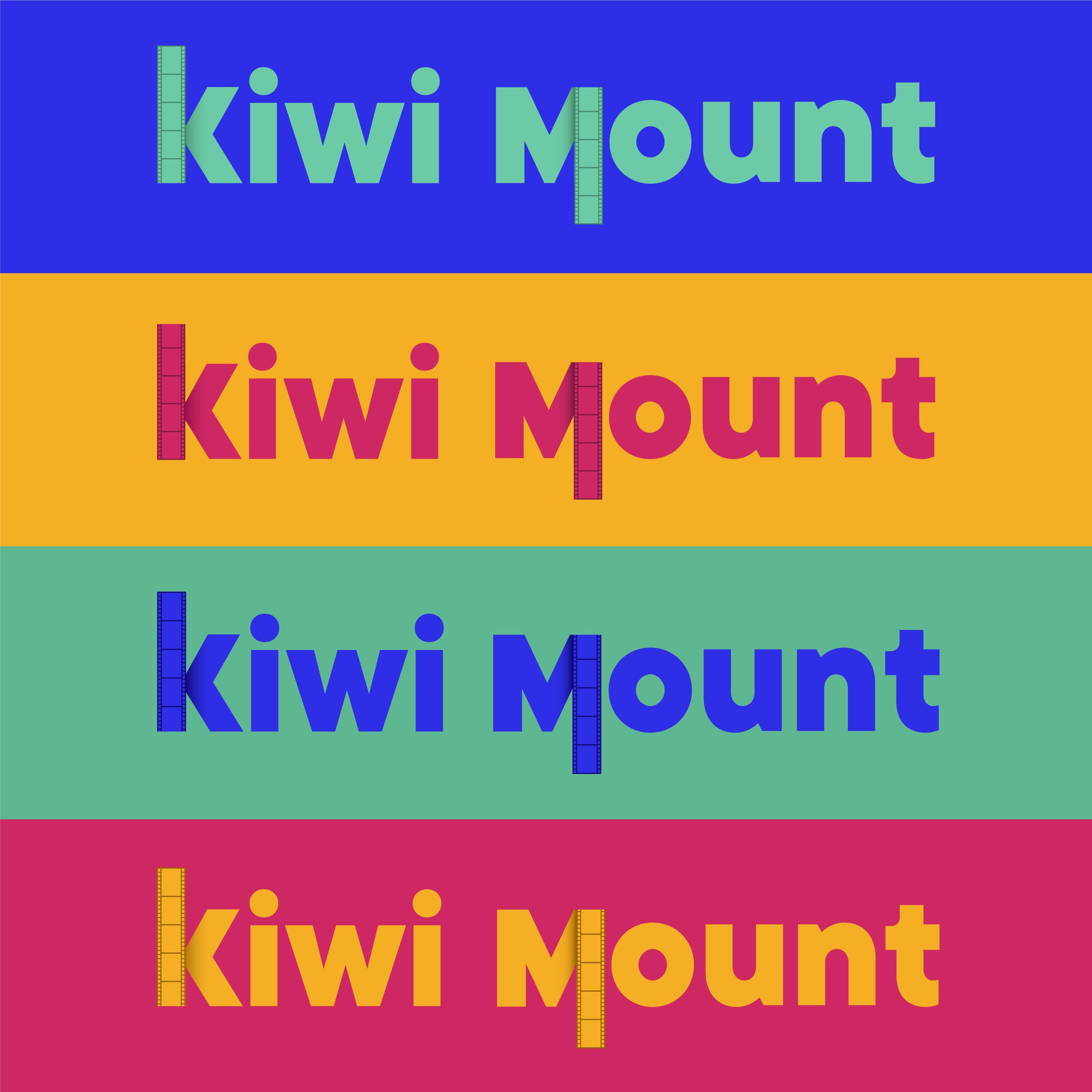
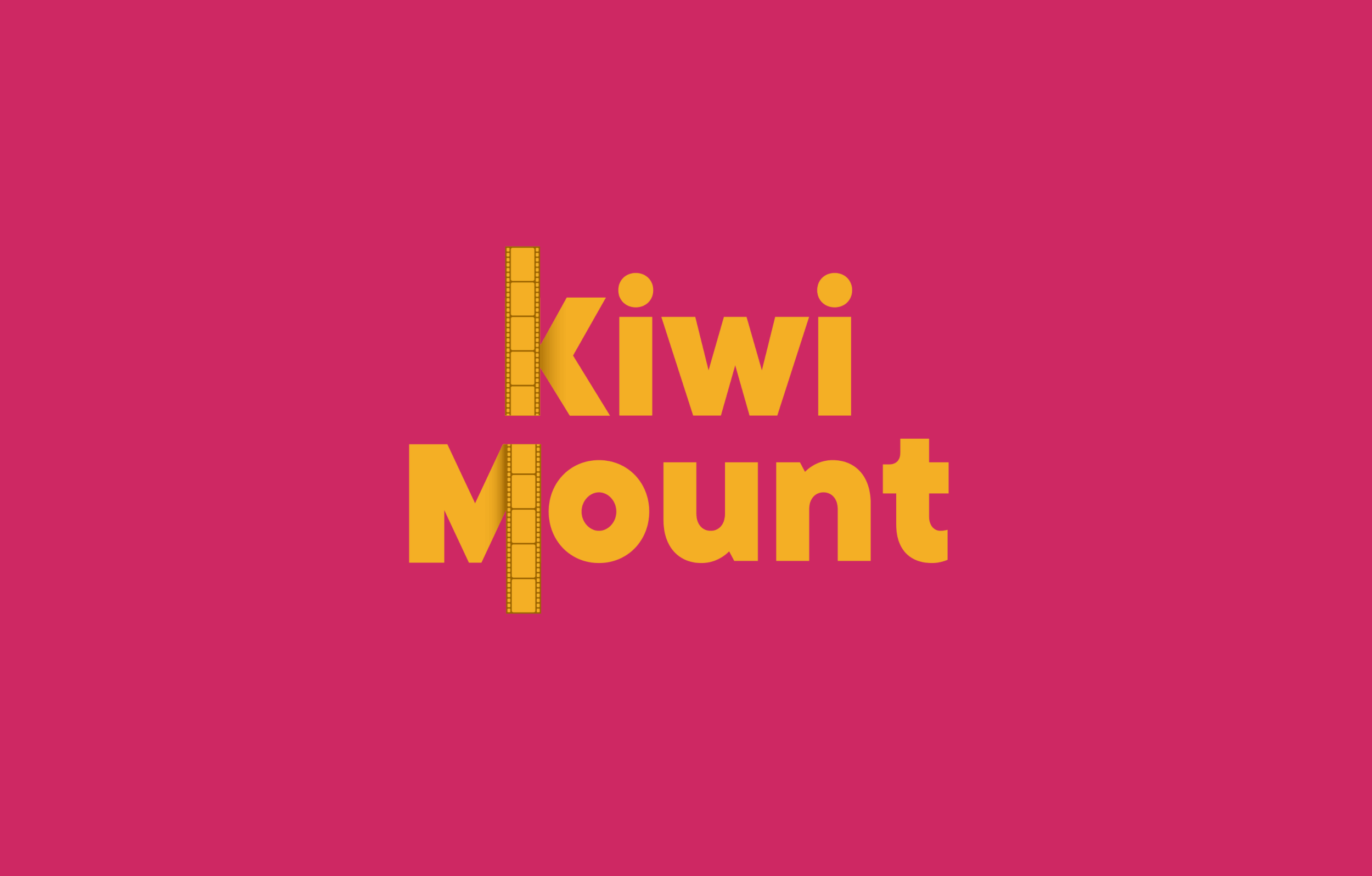
Joy, founder of KM, wanted a loud, clean, timeless, and sophisticated feel for Kiwi Mount. I think we nailed it.

Joy really wanted the logo mark to be clever in some way, but knew that it was a difficult ask. When we presented this, she was over the moon that we pulled off sneaking in a hidden play button.
This mood board was built with images that inspired the following three elements: font, color, and imagery.
Font: Joy wanted Kiwi Mount to feel loud, yet timeless, so we took the direction of bold, san serif typefaces.
Color: Images with a vibrant color-block felt very on-brand.
Imagery: We pulled images with a balance between fun and sophisticated.