Package design for OM Chocolatier
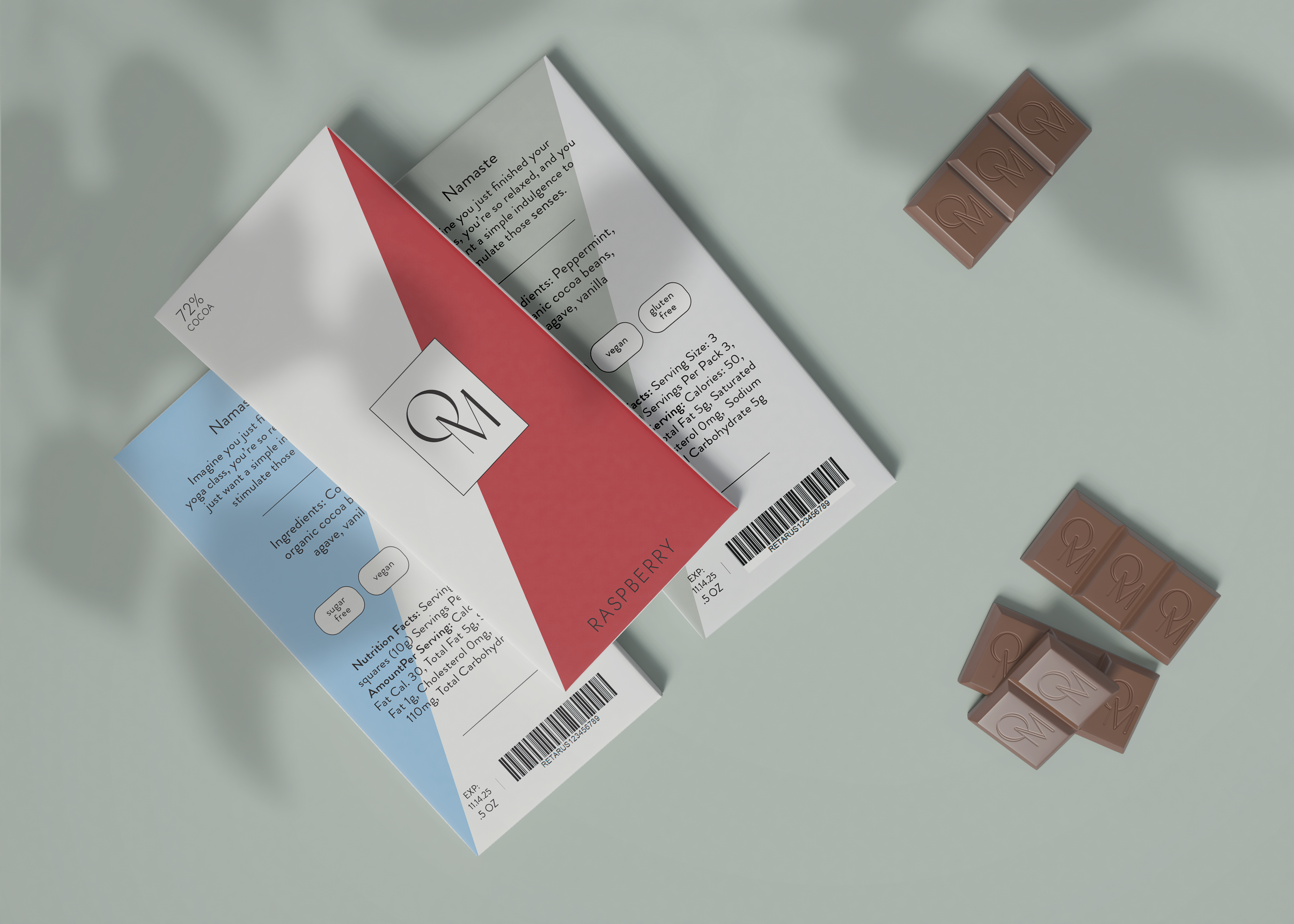
OM (pronounced /ohm/) Chocolatier is an all-natural chocolate brand concept that encompasses simple, chocolatey indulgence. With its simple ingredients, and velvety texture, it’s bound to soothe your palette. The name, “OM Chocolatier” is derived from the sound of meditation. Its ideal customer is someone who is passionate what they put into their body and how it makes them feel. The brand only uses whole, natural ingredients. Preservatives, cane sugars, and artificial flavors are not permitted in any of our products.
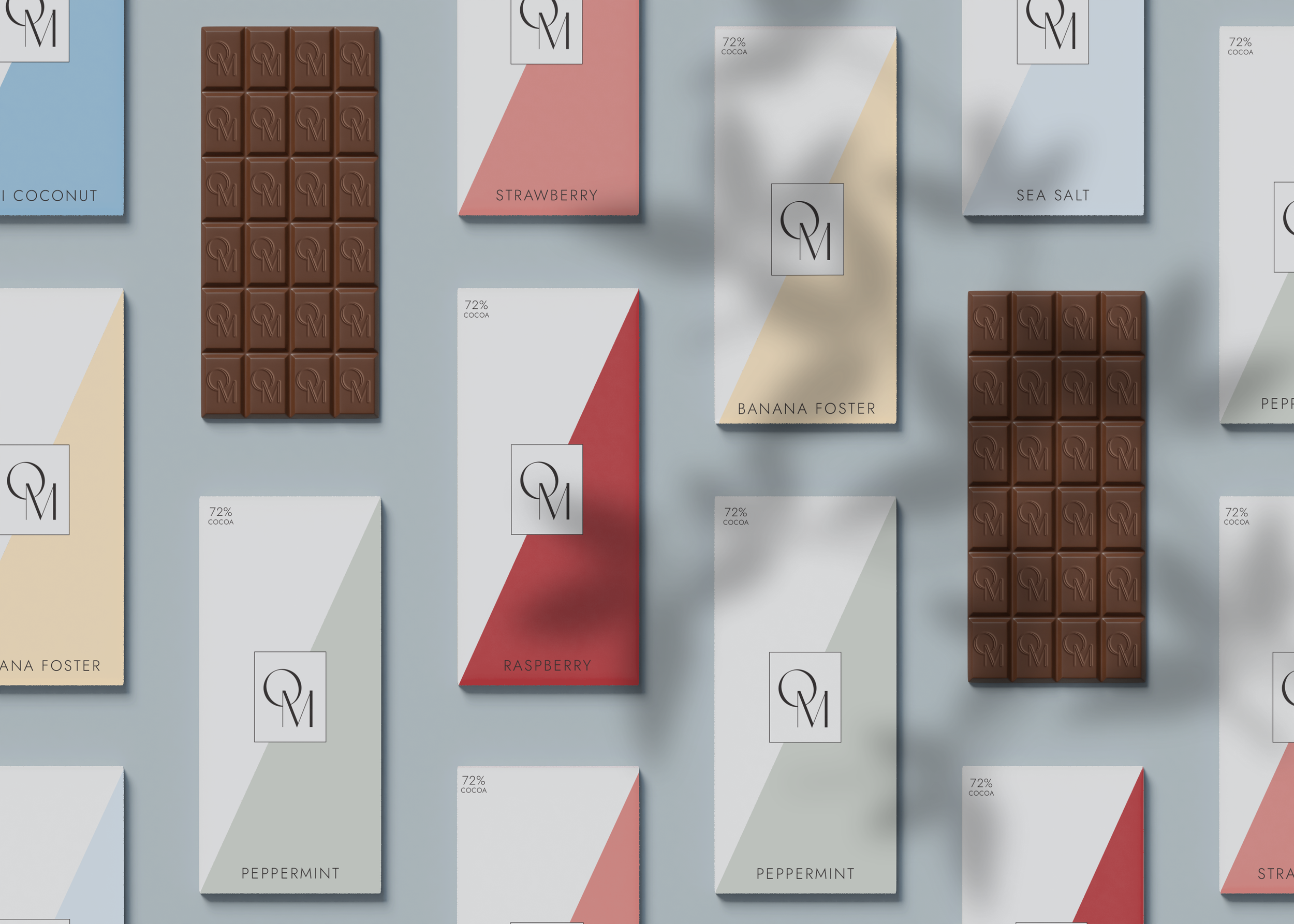
OM’s brand design, through its typefaces, packaging, and imagery, evokes a calm, peaceful feeling. This mood board, through its soothing lines and muted colors, fits OM’s vibe perfectly. The chocolate bars are meant to be sold in yoga studios, fitness centers, Australian cafes, etc.


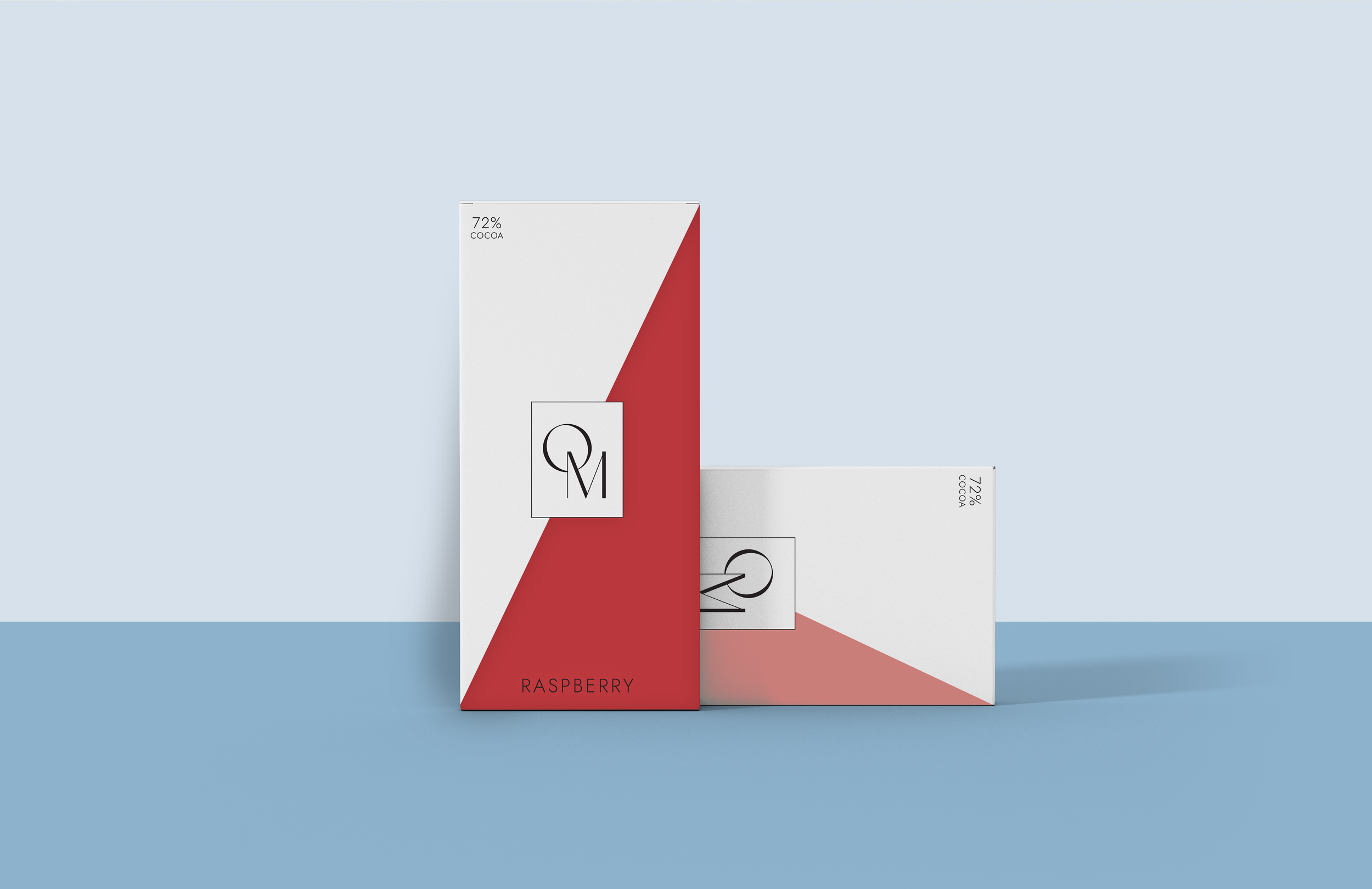
For OM’s logo, we wanted to go with a sophisticated feel, so customers understand its a premium product. Individuals who are conscious about what they eat don’t mind spending a little more for better ingredients. To accompany our premium logo, will be soft lines and calm colors to bring that relaxing energy into the brand.